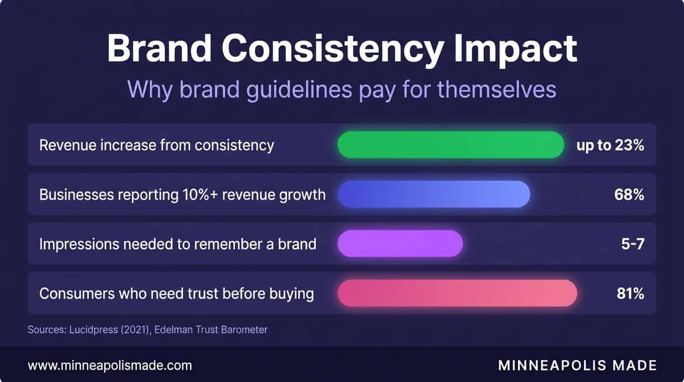
Brand consistency across all platforms increases revenue by up to 23%, according to Lucidpress’s Brand Consistency Report (2021). That’s not from a new logo. That’s from having a system that ensures your brand looks, sounds, and feels the same everywhere it shows up. Most Minneapolis businesses invest in a logo and stop there. They end up with a nice mark on a website that doesn’t match their social media, email campaigns that use different fonts, and printed materials in slightly wrong colors. A brand style guide fixes all of that.
After 25 years building brands for Twin Cities businesses, we’ve seen the difference between companies that have a documented design system and those that wing it. The ones with systems grow faster, spend less on design, and build stronger customer recognition. This guide explains what a brand style guide actually includes, why it matters more than a logo, and how to build one without a massive budget.
Key Takeaways
- Consistent brand presentation increases revenue by up to 23% (Lucidpress, 2021)
- It takes 5-7 impressions for someone to remember a brand (Action Card, 2021). Inconsistency resets that counter every time
- Design systems reduce design and development time by 31-47% by eliminating redundant decisions (Figma, 2024)
- A brand style guide doesn’t need to be 200 pages. Five core elements get you 80% of the consistency benefit
What Is a Brand Style Guide, and How Is It Different from a Logo?
A logo is a single visual mark. A brand style guide is the complete system that governs how your business looks, sounds, and behaves across every touchpoint. According to Lucidpress (2021), 68% of businesses say brand consistency has contributed 10% or more to their revenue growth. The logo is one piece of that system. Without the rest, it’s a symbol floating in a sea of inconsistency.
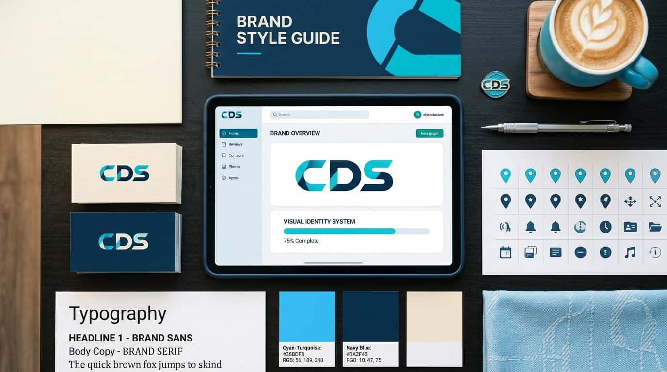
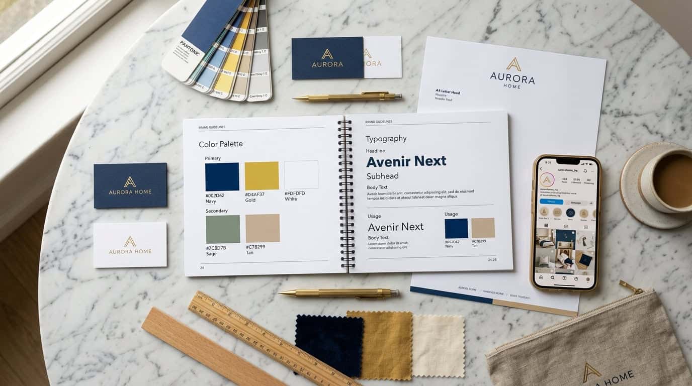
A brand style guide typically includes:
- Color palette with exact hex codes, RGB, and CMYK values
- Typography with primary and secondary fonts, size scales, and weight hierarchy
- Logo usage rules including minimum sizes, clear space, and what NOT to do with it
- Voice and tone guidelines defining how the brand communicates in writing
- Component library with buttons, cards, form styles, and layout patterns
- Photography and illustration style defining the visual mood
Think about it this way. Your logo is like your face. Your brand style guide is your entire wardrobe, posture, speaking style, and mannerisms. People recognize brands the same way they recognize people: through consistent patterns across multiple interactions.
Unique Insight
The businesses we work with in Minneapolis that have the strongest customer recognition aren’t the ones with the most expensive logos. They’re the ones whose Instagram posts, website, business cards, email signatures, and storefront signage all clearly come from the same visual family. The system matters more than any individual element.
Why Does Brand Consistency Matter So Much?
It takes 5 to 7 impressions for a consumer to remember a brand, according to research from Action Card (2021). Every time your brand looks different, you’re essentially starting that counter over. Inconsistent colors on your website vs your social media? That’s two wasted impressions instead of two that build on each other.
Edelman’s Trust Barometer (2024) found that 81% of consumers need to trust a brand before they’ll buy from it. Trust comes from familiarity. Familiarity comes from consistency. A business that looks polished and uniform across every channel signals reliability. One that looks different everywhere signals chaos, even if the actual product is excellent.
For Minneapolis small businesses competing against national chains with massive brand budgets, consistency is the equalizer. You can’t outspend Target on advertising. But you can make sure every single touchpoint looks intentional and professional. That’s something many national brands actually struggle with at the local level.
The Cost of Inconsistency
Without a style guide, every new marketing piece requires design decisions from scratch. What blue are we using? Is this the right font? How big should the logo be? These micro-decisions eat time and produce inconsistent results. We’ve seen Minneapolis businesses spend 3x longer on simple marketing materials because nobody could remember which shade of blue the brand uses.
Rebranding costs between $10,000 and $100,000+ for small to mid-size businesses, depending on scope. Building a proper brand style guide from the start costs a fraction of that and prevents the drift that eventually forces a rebrand.
Related: How to Choose a Web Development Agency
How Do Design Systems Save Time and Money?
Design systems reduce design and development time by 31-47%, according to Figma’s 2024 Design Systems report. That efficiency comes from eliminating redundant decisions. When your button style, heading sizes, color usage, and spacing are all predefined, designers and developers stop debating and start building.
Here’s what that looks like in practice for a Minneapolis business:
Social Media
Templates built on your system. Production time drops from 45 minutes to 10.
Website Pages
New landing pages use existing components. What took a week takes a day.
Print Materials
Brochures, cards, and flyers follow the guide. No back-and-forth with the printer about colors.
Email Campaigns
Templates match the brand automatically. Your marketing person doesn’t need to be a designer.
Personal Experience
One of our Minneapolis clients, a mid-size professional services firm, was spending roughly $2,000 per month on ad-hoc design work. After we built them a brand style guide with templates, their monthly design spend dropped to $600. The guide paid for itself in two months.
Related: AI Content Creation: Why Hybrid Workflows Beat Pure AI
What Are the Essential Elements of a Brand Style Guide?
You don’t need a 200-page brand book. We’ve seen Minneapolis startups paralyzed by the idea that they need a comprehensive brand bible before they can market their business. Start with these five elements. They cover 80% of the consistency you need.
1. Color Palette with Exact Values
Define your primary color, secondary color, and 2-3 accent colors. For each, specify hex codes (for web), RGB (for digital), and CMYK (for print). Include light and dark variants. Show examples of correct and incorrect usage. Without exact values, “our brand blue” becomes five different blues across five materials.
2. Typography Scale
Choose two fonts maximum. One for headings, one for body text. Define your size scale: H1 through H4, body text, captions, and small text. Specify weights (regular, medium, semibold, bold). Include the Google Fonts or Adobe Fonts link so anyone on your team can install them immediately.
3. Logo Usage Rules
Show your logo in its primary form, reversed (white on dark), and any simplified versions. Define minimum size (usually 1 inch or 100px wide). Specify clear space (the minimum buffer around the logo). Show 5-6 examples of what NOT to do: don’t stretch it, don’t change the colors, don’t put it on busy backgrounds, don’t add effects.
4. Voice and Tone
Describe how your brand speaks. Are you formal or casual? Technical or accessible? Serious or playful? Give before-and-after examples. “We don’t say ‘utilize,’ we say ‘use.’ We don’t say ‘leverage synergies,’ we say ‘work together.’” This is the most overlooked element and the one that makes the biggest difference in customer perception.
5. Component Patterns
Define how buttons, cards, forms, and navigation elements look. This matters most for digital. If your website uses rounded cyan buttons but your email uses square blue ones, the disconnect erodes brand recognition. Even simple patterns like “all buttons use 8px border-radius and our primary sky blue” create powerful consistency.
Original Data
In our work with Minneapolis businesses, the brand guide elements that have the highest impact on consistency are, in order: color palette (eliminates the most variation), typography (second-most visible inconsistency), and voice/tone guidelines (most overlooked but highest customer impact). Logo rules, ironically, matter least because most people already know not to distort their logo.
How Do Minneapolis Small Businesses Build a Brand Style Guide on a Budget?
You don’t need to hire a big agency. Minnesota has 547,493 small businesses according to the SBA’s 2025 Minnesota profile, and most of them operate without formal brand guidelines. That’s an opportunity. Even a basic guide puts you ahead of the vast majority of local competitors.
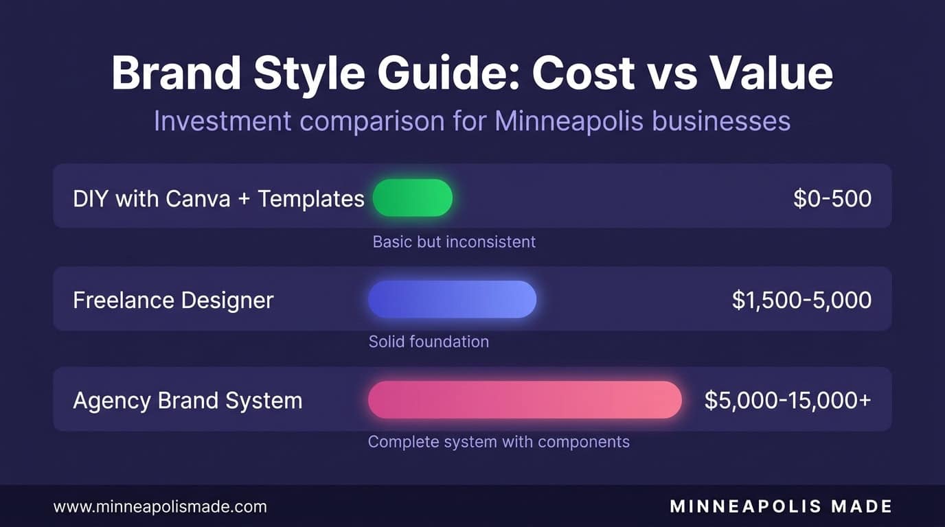
DIY Approach ($0 – $500)
Use Canva’s brand kit feature to store your colors, fonts, and logo. Create a one-page PDF with your core rules. Share it with anyone who creates content for your business. This takes a weekend and costs nothing but time. It’s not comprehensive, but it’s infinitely better than nothing.
Professional Starter Guide ($1,500 – $5,000)
Hire a designer to build a 10-20 page brand guide with proper color specs, typography, logo rules, and basic component patterns. This is what most Minneapolis small businesses need. It should include templates for your most common materials: social media posts, email headers, and basic print layouts.
Full Brand System ($5,000 – $25,000)
A comprehensive system with strategy, design, component library, voice guidelines, photography direction, and implementation across all channels. This makes sense for businesses with multiple locations, large teams, or complex marketing operations.
Related: WooCommerce vs Shopify: Which Platform Wins for Minneapolis Retailers?
Ready to stop winging your brand?
We build brand style guides for Minneapolis businesses at every budget level. From one-page quick-start guides to full design systems with component libraries. Consistent brands grow faster.

What Does a Real Brand Style Guide Look Like?
Here’s what we include when we build a brand guide for a Minneapolis business. This is a real deliverable structure, not a theoretical framework:
- Brand Overview (1 page): Mission, values, positioning statement, target audience
- Logo System (2-3 pages): Primary, secondary, and icon versions. Clear space, minimum sizes, incorrect usage examples
- Color Palette (1-2 pages): Primary, secondary, accent colors with hex, RGB, CMYK, and Pantone values. Usage ratios (60% primary, 30% secondary, 10% accent)
- Typography (1-2 pages): Font families, size scale, weight hierarchy, line heights, letter spacing
- Photography & Imagery (1-2 pages): Photo style direction, color treatment, subjects, mood. Stock photo guidelines
- Voice & Tone (1-2 pages): Personality traits, do/don’t examples, channel-specific tone variations
- Digital Components (2-4 pages): Buttons, cards, forms, navigation, spacing grid
- Templates (varies): Social media, email, presentation, and print templates
Total: 10-18 pages for a starter guide. Enough to keep your brand consistent without overwhelming your team.
Personal Experience
The brand guides we build for Twin Cities businesses always include a “quick reference card,” a single-page cheat sheet with the hex colors, font names, logo files, and voice tone. This is the page people actually use daily. The full guide is for reference. The cheat sheet is for action.
Related: Website Speed Optimization: The Real Cost of a Slow Website
Related: Brand identity and graphic design services
Related: Web design that brings your brand system to life
Related: How your brand system elevates product photography on a budget
Related: Brand consistency in email: why it matters for conversion
Frequently Asked Questions
How much does a brand style guide cost?
For Minneapolis small businesses, expect $0 for DIY (Canva brand kit), $1,500 to $5,000 for a professional starter guide, and $5,000 to $25,000 for a comprehensive brand system. The right investment depends on your team size, number of marketing channels, and growth plans. Most businesses get the best ROI from the $1,500-$5,000 range.
What’s the difference between a brand guide and a design system?
A brand guide defines visual and verbal identity rules (colors, fonts, voice, logo usage). A design system extends that with reusable code components, interactive patterns, and developer documentation. Small businesses need a brand guide. Software companies and large organizations typically need a full design system. The principles are the same; the scope differs.
How often should a brand style guide be updated?
Review annually, update when something changes. If you add a new product line, enter a new market, or redesign your website, update the guide to match. The guide should reflect reality, not aspirations. We’ve seen Minneapolis businesses with brand guides from 2018 that no longer match anything they actually produce.
Can I create a brand style guide myself?
Yes, for the basics. You can document your colors, fonts, and logo rules yourself using free tools like Canva or Google Docs. Where professional help makes the most difference is in strategy (choosing the right positioning), typography selection (pairing fonts that work together), and component design (creating reusable templates). Start DIY, then invest in professional refinement as your business grows.
Do I need a brand style guide if I’m a solo business?
Yes, even more so. When you’re the only person making design decisions, a guide prevents drift over time. You’ll thank yourself six months from now when you need to create a new flyer and can’t remember which shade of blue you used. It also makes delegation possible: when you hire a freelancer or VA, you hand them the guide instead of explaining your brand from scratch every time.